IELTS Report, topic: Bar chart of average rainfall by month (from IELTS High Scorer’s Choice series, Academic Set 1)
This is a model response to a Writing Task 1 topic from High Scorer’s Choice IELTS Practice Tests book series (reprinted with permission). This answer is close to IELTS Band 9.
Set 1 Academic book, Practice Test 1
Writing Task 1
You should spend about 20 minutes on this task.
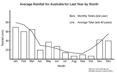
The bar chart below shows the average rainfall for Australia by month for last year. The line shows the average rainfall for Australia by month for the last 40 years.
Summarise the information by selecting and reporting the main features, and make comparisons where relevant.
You should write at least 150 words.

Sample Band 9 Report
This report will describe a bar chart showing the average rainfall for Australia last year by month and the average rainfall in Australia for the past forty years.
Overall, it can be seen that the average rainfall for Australia last year was a little lower than average rainfall in Australia for the past forty years, but generally followed the same pattern.
The average rainfall of the last forty years in Australia decreased from a peak at the beginning of the year to lows in the months in the middle of the year. Towards the end of the year rainfall rose again. Rainfall data for last year generally followed the same trend as the last forty years’ average.
Although the general pattern of the two sets of data is similar, there are some differences. The line representing the accumulation of the average rainfall from the past forty years begins at around eighty millimetres in January and then drops sharply to around thirty millimetres in April. Rainfall then drops slowly to around thirteen millimetres in September and then again rises steadily to just under sixty millimetres in December. Average rainfall for the last year was a little lower than the forty-year average for most months, excepting March, May, June and November when the rainfall was a little heavier. August and October were particularly dry when compared with the forty-year average, at around five millimetres each compared with about fifteen and twenty millimetres each respectively for the forty-year average.
Go here for more IELTS Band 9 Reports
